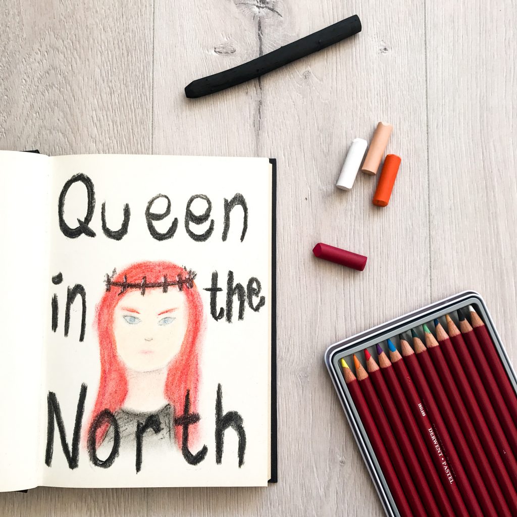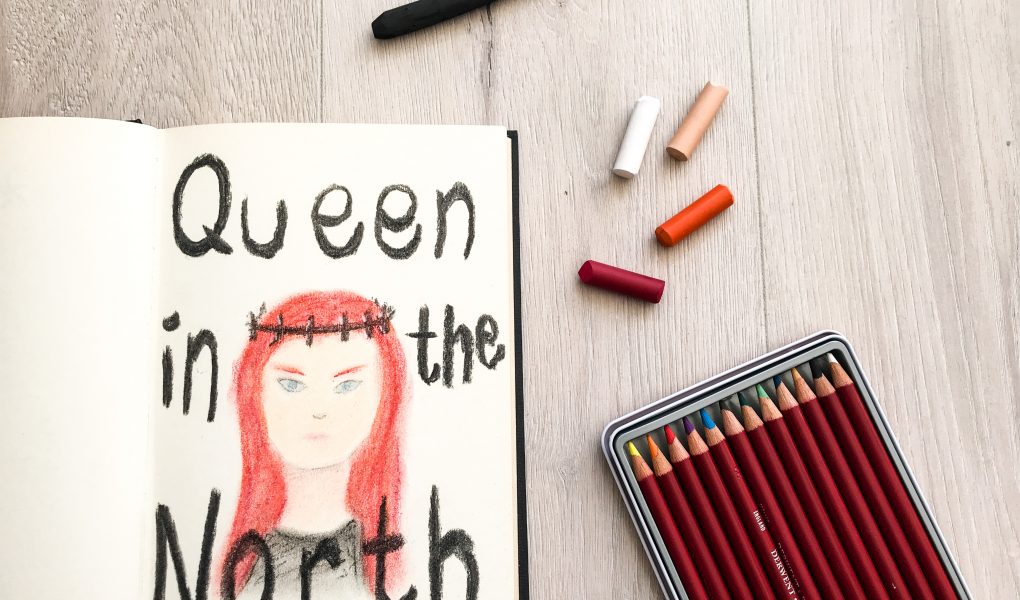
Do you remember? Over a year ago, the final season of Game of Thrones aired. People who named their daughters Khaleesi wished they hadn’t, the final battle for the throne began and I was Team Sansa all the way. Also over a year ago, I pulled ‘Game of Thrones’ from my Jar of Ideas.
It seemed like the perfect word in that time, but I struggled so much with what to make! There are so many cool characters and animals (or dragons!) to choose from, that I kept postponing working on this word. Even though I was Team Sansa, I was (and still am) also drawn to the other heroes: Danaerys, Jon, Tyrion, Arya. And with a theme so big, I could also go back to older seasons and use Khal Drogo or Ned Stark as inspiration.
And there it was, last weekend: the inspiration I needed. The word has been popping up in my brain every once in a while, stirring some ideas and vanishing again. But this time, it stuck. “Sansa, Queen in the North”. And again, being Team Sansa this seems like the obvious choice, but I need to have an image in my brain to get started. It took me over a year to get it. Yes, I am ashamed of myself.
So I had the image, the materials and the time, and voila! A new drawing was born on Monday morning!
Materials and method
- Pastels
- Pastels in pencils
- Charcoal
- Pencil
I stared with drawing a rough sketch of Sansa with pencil. Then I colored this in with the pastels and pastels in pencils, using the pastels in pencils for the smaller details and pastels for big parts. After that, I used my fingers to rub everything (what a mess!).
Then I used charcoal to draw the crown and white pastels to apply some details to the metal. The charcoal was also used to write the words.
What I think about it now
Besides the feelings of shame that it took me so long, I am actually pretty satisfied. There are some things that I can’t even look at because they are so ugly, but overall I like it.
The face is what I hate the most. Actually, that might be the only thing I hate. But it consists of so many elements, that it really bothers me a lot.
I love the hair (the mixing of colors), the neck (damn, I did a good job on that shadow!) and mostly I love the letters “e” in the words. I sort of made the font up myself, but I like it so much #proud.
Next time…
The new word is “Boobies”. Enjoy! (And I promise, this time I will finish within a few weeks)
I hate how WordPress keeps cropping my featured images and I am working on that, but in the meantime here is another photo of my work 🙂